BTC On-Chain Analysis: Previously Dormant Coins Continue Moving
3 min readA look at on-chain indicators for BTC (BTC), more specifically Spent Output Age Bands (SOAB) and the HODL wave in order to see the age of the coins that are being transacted at the current time.
The indicators show selling that was done by coins that have previously remained dormant for three to five years. Interestingly, coins that were purchased nearing the end of the bull-run and are either at break even or at a slight loss have not been on the move.
Spent output age bands
SOAB uses colors to show the age in which the most recent unspent transaction output (UTXO) was created. Therefore, the bands of 6m-12m shows current BTC transactions whose UTXOs were created between 6-12 months earlier.
When looking at the indicator since July, there are two distinct spikes, on Aug. 1 and Aug. 17.
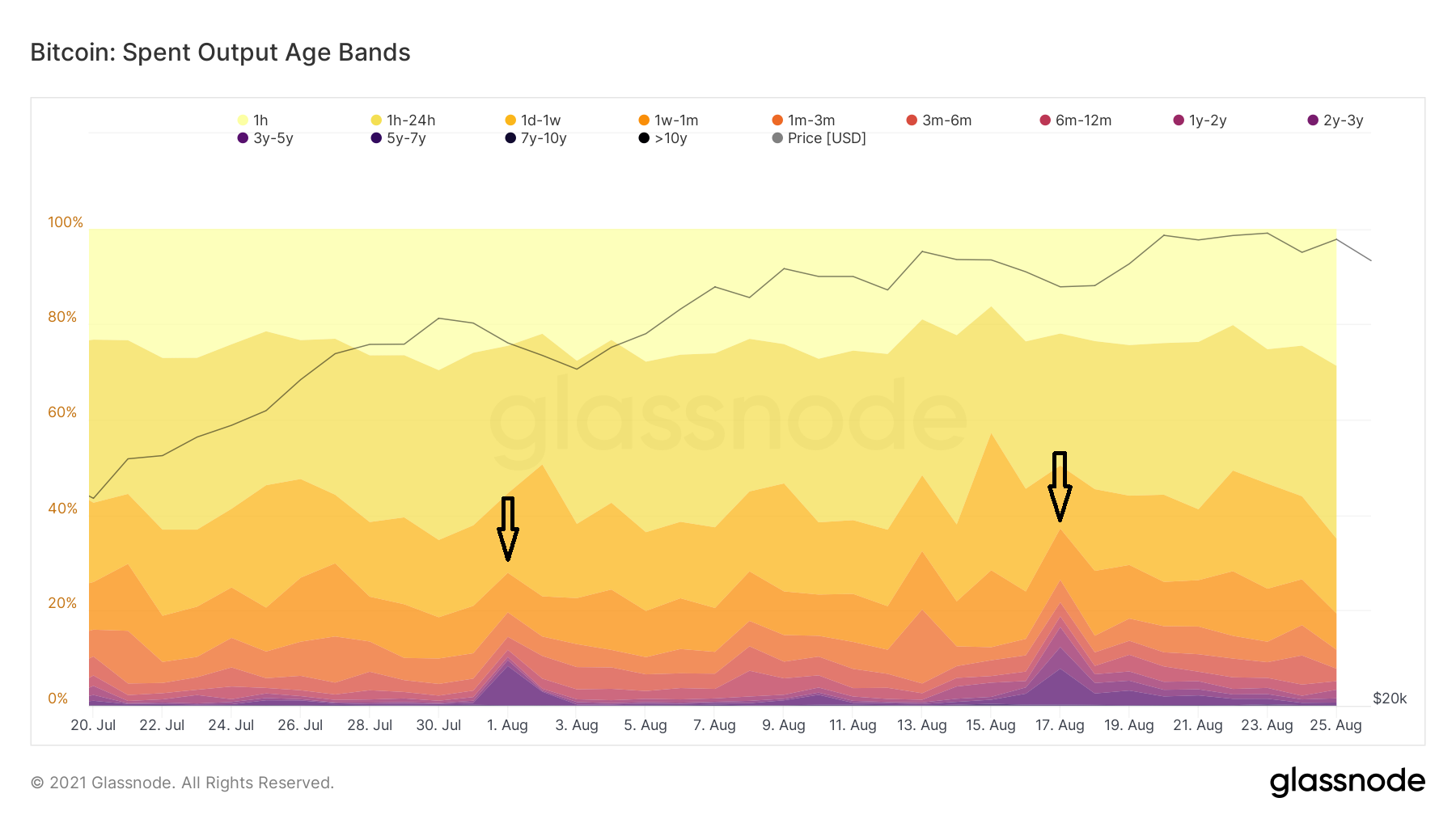
The spikes were mostly noticeable in bands with the length between two and five years (purple).
In the Aug. 1 spike, the majority of the transactions were created by the 3-5y band (dark purple). Meanwhile, in the Aug. 17 spike, both bands increased at an almost equal ratio.
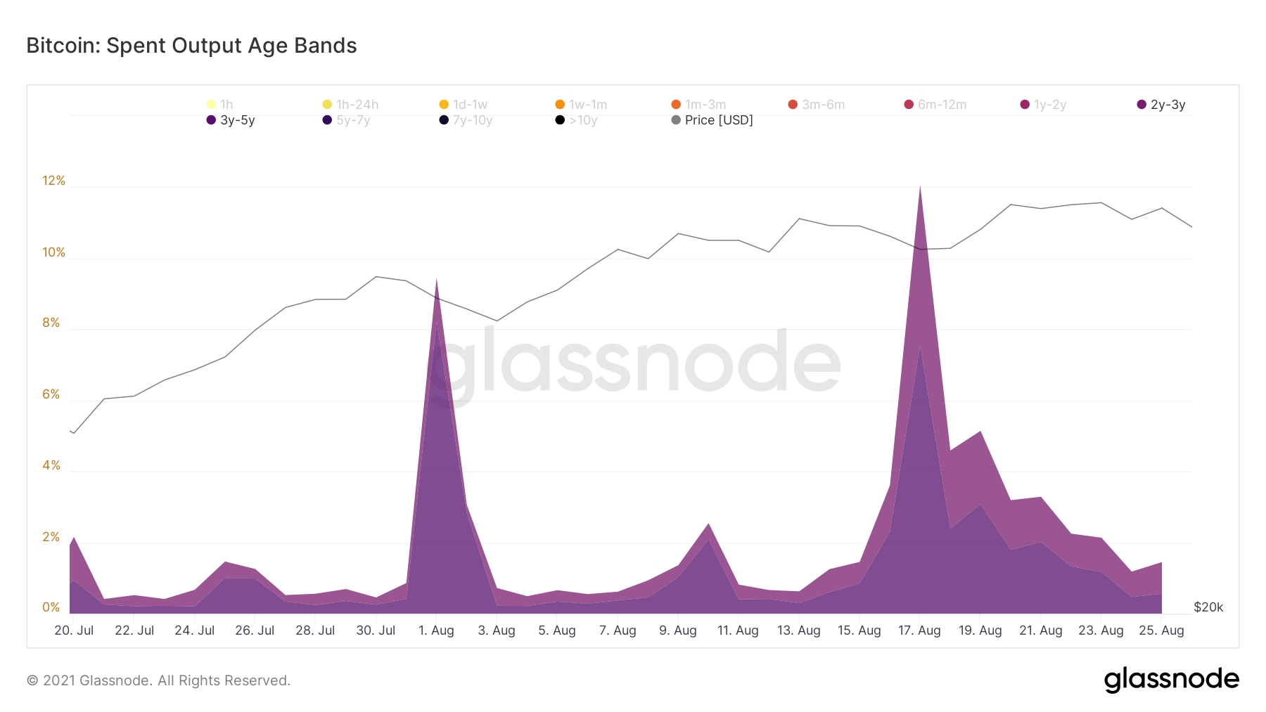
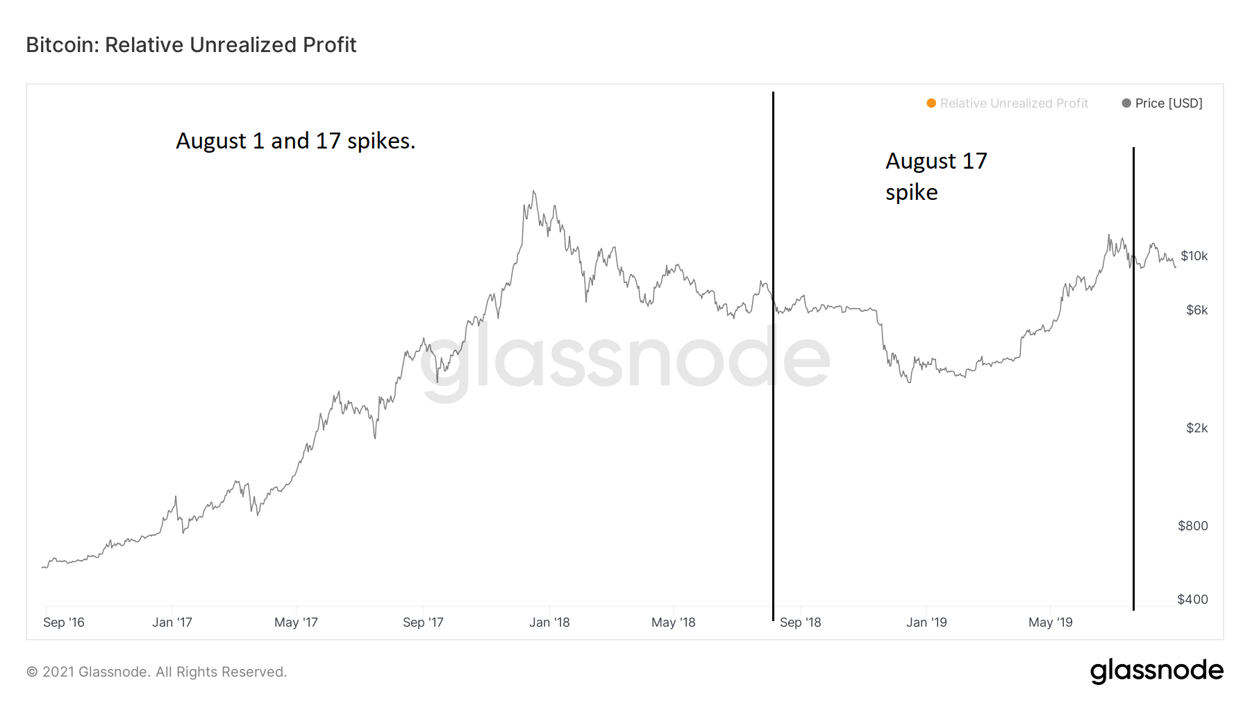
This means that the first spike was caused by selling of BTC that had previously transacted between August 2016 and 2018. On the other hand, the second spike was caused by that same period and the August 2018-2019 one.
Inside these periods, BTC had traded between $600 and $20,000. While the price in itself is not extremely important, the fact that old coins are being spent indicates that the ongoing bounce could be a relief rally.
BTC HODL wave
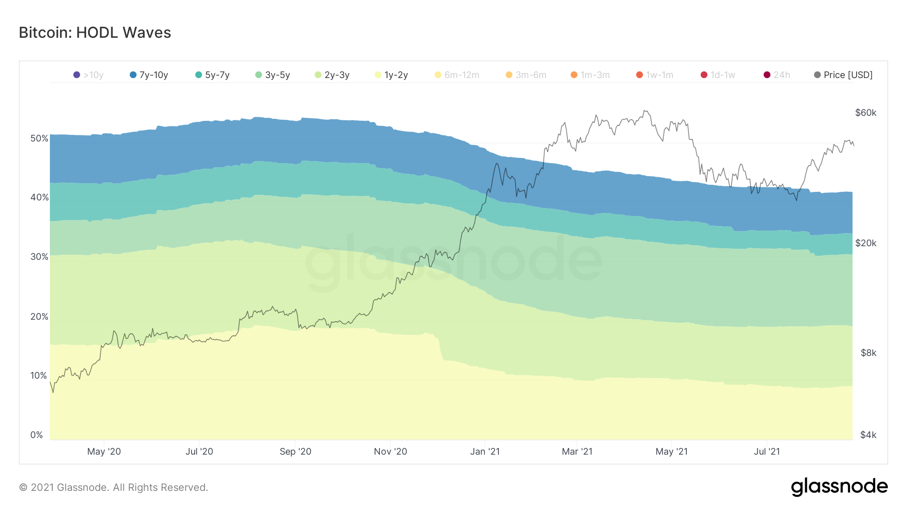
HODL waves show the percentage of BTC that has moved in a specified time period. Therefore, if the HODL wave of 6m-12m is 15%, it means that 15% of the total BTC in existence have moved between 6-12 months ago.
The main difference with SOAB is that the former takes current transactions and measures when the previous transaction occurred, while the latter shows the ratio of BTC moved in a specific time period with the total supply of BTC.
A look at the HODL wave shows that the 6m-12m wave is swelling, while those less than six months old are decreasing. This means that have bought in the last 3-6 months are not selling at a loss or near break even. Rather, that they are holding, thus their coins are maturing into the 6m-12m band.
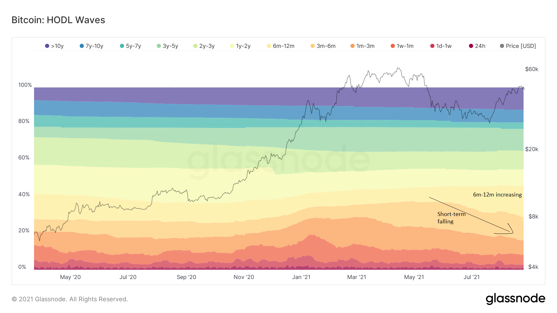
There is a slight decline in the 3-5year band (green), who represents 12% of the transactions in relation to 13.5%, as it did in the April all-time high. In addition to this, both the 1-2 and 2-3 years bands (light green and yellow) have decreased by roughly 1%.
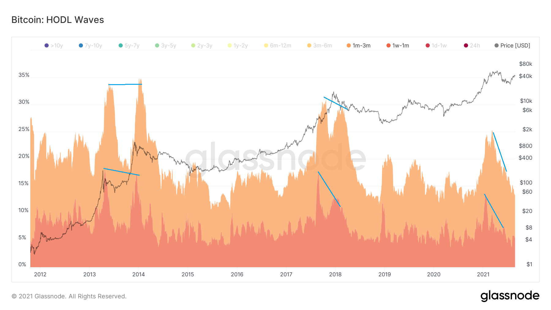
Finally, an interesting development is the fact that in each previous BTC cycle top, there was a bearish divergence between the 1w-1m and 1m-3m bands. The same occurred during the current all-time high.
For BeInCrypto’s latest BTC (BTC) analysis, click here.
The post BTC On-Chain Analysis: Previously Dormant Coins Continue Moving appeared first on BeInCrypto.


